
There are 8 other images of this object. See our image rights statement.
Object Timeline
|
2020 |
|
|
2023 |
|
|
2024 |
|
|
2026 |
|
Interactive News Story, “An Incalculable Loss,” The New York Times
This is a Interactive news story. The New York Times; Research and editing: Clinton Cargill, Annie Daniel, Alain Delaqueriere, Richard Harris, Barbara Harvey, John Haskins, Jonathan Huang, Simone Landon, Juliette Love, Grace Maalouf, Alex Matthews, Farah Mohamed, Steven Moity, Destinée-Charisse Royal, Yuriria Avila, Alex Lemonides, Chi Zhang, Jason Bailey, Eric Morse, Alison Peterson; Design and production: Matt Ruby, Eden Weingart, Lazaro Gamio, Gabriel Gianordoli; Illustration: Larry Buchanan; Writing: Dan Barry. It is dated May 27, 2020 and we acquired it in 2024. Its medium is original: software (interaction design, web-based). documentation: web archive and video. It is a part of the Digital department.
The video above is a screenrecording that documents a possible interaction with the piece.
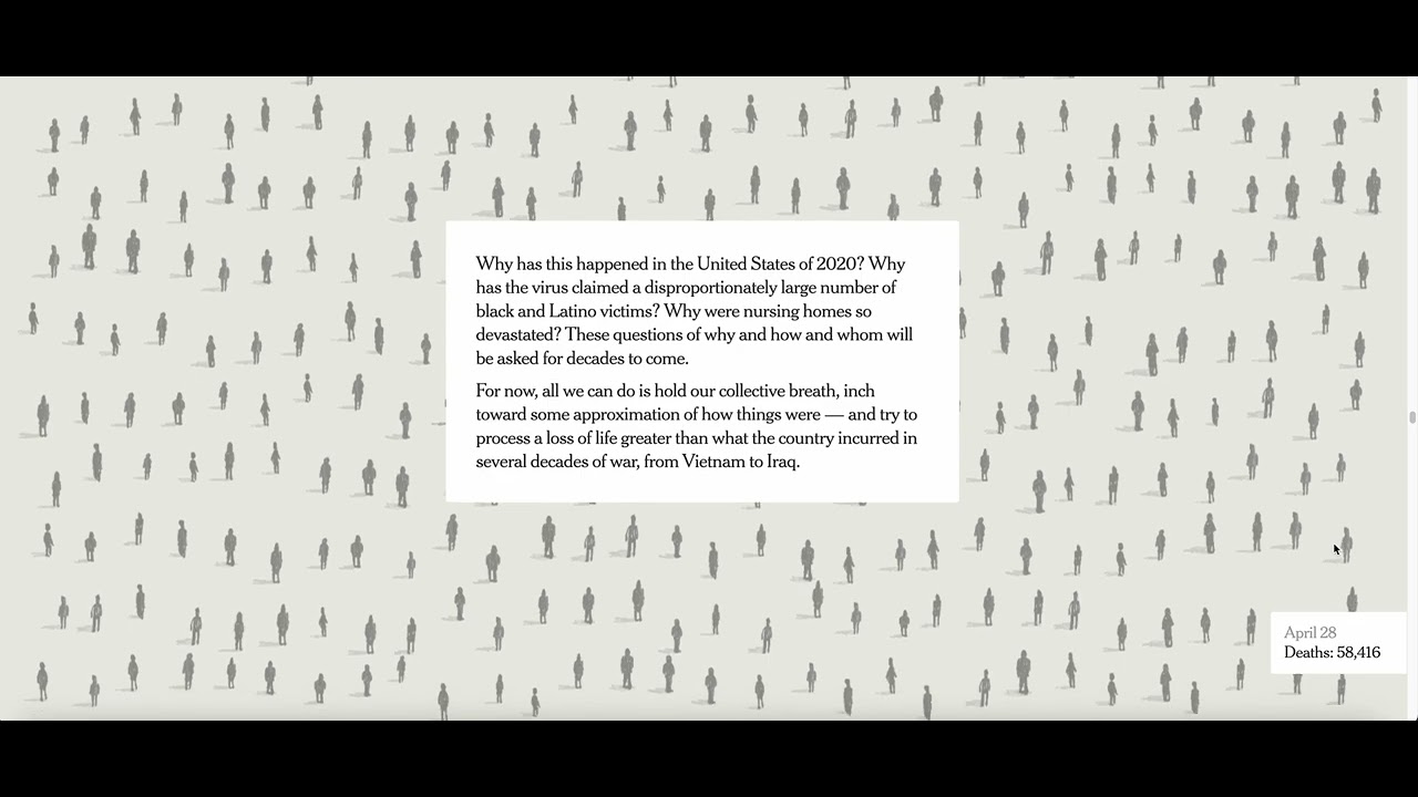
The interactive graphics story, "An Incalculable Loss," was digitally published by The New York Times on May 27, 2020. Conceived as a digital-first story, it was a massive team effort, pulling in 26 journalists from across the Times newsroom. The piece also ran on the front page of the Sunday newspaper on May 24, 2020.
In the early days of the pandemic, charts and data consumed Americans as health agencies tracked the impacts of the disease. As the death numbers rose, assistant graphics editor Simone Landon marshalled Times researchers, editors, writers, designers, and producers to create a piece about an inevitable threshold—reaching 100,000 deaths in just three months. As she explained, the number at that time "seemed sort of unimaginable… It felt like there was an opportunity to try to think about that number in a new way, not just as a chart with a line going up to the right."
The resulting interactive graphic is designed as a seemingly infinite scroll dotted with illustrated figures, which each represent a deceased American. Snippets from obituaries published in local newspapers appear beside some of the figures. A sweeping narrative text overlays the work. The piece is a data-driven article, but more than presenting a big number, it succeeds in using digital visual storytelling to evoke the emotion and human toll behind that number. It shows us what the eye can’t see. The story demonstrates how graphic design during the pandemic made visible our collective grief, capturing what felt like inconceivable immensity.
It is credited © The New York Times, acquired with permission and cooperation of The New York Times.
Cite this object as
Interactive News Story, “An Incalculable Loss,” The New York Times; Produced by The New York Times; original: software (interaction design, web-based). documentation: web archive and video; © The New York Times, acquired with permission and cooperation of The New York Times; 2024-14-2